
Maps Redesign Concepts 2022 - UNIVERSITY
Planning and prototyping a feasible route-saving option for google maps

THE BREIF
To create redesigns that present clear, compelling, and elegant improvements, while using the existing design system of google maps
CLIENT
UNIVERSITY OF WASHINGTON
Foundations of Interaction Design
TIMELINE
4 weeks
FOCUS
UI, UX
TEAM
Me
MY ROLE
N/A
CREDITS
James Pierce
My Design Process
The visualized flow of this project, scrolling through this project you can see how I was feeling from where I started to the end result.

<
THE PROBLEM
Analyze the pain points, and limitations of google maps to idenitfy the area of focus.
<
OBJECTIVES
How might we improve the google maps user experince?
<
RAPID USABILITY TESTING
What are other users experinvce currenlty like with google maps?
What are the pain point sof their user experince?

<
Heuristic Evaluations
What are my personal finding from using google maps?
After analyzing the user expeince both personally and with other users, what conculsions can we draw about the program?

<
IDEATION
SKETCHING
Using the pain points as guidelines I started by rapidly stecking out quick ideas that could be a benifi=cail addion or change to the existing UI of Google Maps.

<
DESIGN SPRINT
LOW FIDELITY IDEATION
Focusing more closley on my favorite ten ideas, from the sketching I begun low fidelity ideation along with a use case for each to correlate to my ideas.

<
DESIGN SYSETEM
Design OUTLINE
As I began to shift my project onto my more concerete ideas, I first outlined the Google Maps design system so that as I began to design further I was prepared to make sure my content aligned with their existing design foundations.

<
PROJECT SHIFT
ORGINAL DESIGNS
Finding my two ideas for redesign was difficult after my ideation process. Though eventually I went with a more challenging novel idea and a smaller visaul redesign.
Saved Routes, Bottom Nav Bar
Saved Routes - Though there is saving for something like “travel” in which you can save to a category, there is no way to save multiple stops along a route
Bottom Nav Bar - With usability studies my research showed a lack of usage to the bottom nav bar making the menu seem overwhelming

<
PROBLEM / OPPRITUNITY
Saved Routes
Saving
- Being able to save route would create a ease of access for frequently used routes like a commute
Planning
- Having the ability to save multiple stops create the ability to pre plan stops for trips creating a better experince
Bottom Nav Bar
Spacing
- The nav bar takes up a lot of space within the display, for utilities that go more or less utilized

<
Design Focus
Low Fidelity Ideation
With my focus now on two very specific areas of the google maps system. Creating quick ideation of screens helped me further my progress of each state.
Saved Routes

Bottom Nav Bar

<
Design Focus
Click-Thru Prototypes
Using my low fidelity ideation as a ground work I created mutiple versions of eash set as click thrun protoype to get the feel of how the user would interacte with these new states. Using these click-thru prototypes were the bases for my next step in user testing. These click-thru prototypes were made not only for me but to have user help give me feedback on the direction of this progress.

<
RAPID USABILITY TESTING
Click-Thru Prototypes
Script
Hello, I am Cobi Stancik I have brought your here to conduct a rapid usability test for variants on Google Maps. This process should be roughly 15 minutes.
The objective of this session is to observe how you interact with this interface, and identify any issues that may come up while you use it. This is a test purely on the ability of the interface so don’t worry about making mistakes.
First I will show you the current version of active components on google maps that we will be looking at today, so that you can have a reference to the variant we will be looking at today.This task I am prompting you to “talk will using”. We will go through each variant and as you use then simply talk about how you feel things you notice, things you like, things you don’t like. After a set of variants I will have you Talk to me about the positives and negatives you experienced while using them.
I appreciate your time and willingness to work along side me for this test. Before you go, I would like to discus any major issues or problems you encountered while using the app...
Did you feel the variations made an existing improvement on the current status of google maps?Were there any gripes you had while using the variants?
Thank you
Introduction (5 minutes)
Debrief (5-10 minutes)
Tasks (10 minutes)
General Assessment (5 minutes)
Interview 1 - NOTES
Felt like both concepts improved on current google maps
Light gray for “Shared and Private” is hard for readability
Visual person enjoys the slider bar oin V1, and V3 for tracking on Travel
Enjoys the layout of the time an miles most on the V3 for the list of places
The Icon use on V3 Travel works well next to the titles of sliders
Likes having the nav bar higher up when accessing the “pages”
Is a “creature of habit” likes to learn then to repeat (V2 not good for that as it wasn’t intuitive enough for them to calculate where the “pages” was on the screen
Doesn’t feel they need their own photo of their house when going on a trip (icon might work instead)
Likes the intuitiveness of V2 and V3 of travel slider more sore than V1 sighting the private and share is more prominent and easier to navigate
V3 has the edit tools, and other buttons at the bottom which they say “is where buttons should be” pointing out that having them lower creates a better ease of activity with the user
Interview 2 - NOTES
V2 Menu lacked as the 3 lines is universal as a menu but doesn’t translate to google maps as it is something that doesn’t already exist or would have to be implemented into there google products to have the effect you are looking for
Also mentioned the idea of not having your house as a main photo for traveling creating a card instead could work
The travel car icon could be on the same plane as the time/milage to show the mode as you change from one card (place) to another
V1 Travel vertical scroll should have a toggle between your private and shared for ease, the view all is overwhelming
There is a Gestalt Principle active but he would like a indicator on horizontal scroll feels he doesn't know when to scroll horizontally
Really likes the travel slider
TESTING ANALYSIS
A reoccurring pain point was the image that correlated to one’s home on the travel slider. Making it a icon may resolve the issue of “feeling weird looking at my own house.. like I live there I already know what it looks like”. Keeping on Menu having the dropdown actively showing “Explore” or any of the other pages helps keep the user knowing that there is a possible action unlike the 3 dashes. Additionally the bottom nav bar buttons for on the travel slider is a much better contribution than the action on the top of the slider. Overall from the two users the V3 of travel was the best variation, with recommendations to the timing area that shows the iconography to indicate the mode of transportation rather than on the card itself (showing the process of moving). The V3 of Menu also was the most fluid variation, noting th search bar at the top and the dropdown was much more intuitive, than the others. Siting V1 Menu has a big issue with the navigation dropping over the search bar.
<
FEEDBACK
PROJECT DIRECTION
Along with the feedback through my user testing, I also provided my design progress thus far to my design professor and peers. The biggest piece of feedback was the length at which I wanted to pursue the project. I had a very ambitious novel feature I wanted to add and a smaller design change to the menu. The option was to make sure both were worked on equally before the time constraint of the project was up, or stick with the more ambitious project of a novel feature and flush it out completely before the time constraint. I felt I was more inspired to work on the novel route-saving feature though it was going to be more work, as by this point in the project there was about a week before the final project was to be submitted.
<
Use Case Instance
SCENARIO - ROUTES
Melissa a mom of two is wanting to plan out her family trip for next summer. She wants to be able to save her route and stops, so she has a organized navigation experience.

SCENARIO - MENU
Derek a biking enthusiast, wants to be able to explore streets to find cool places to bike. He wants to be able to explore clearly without a overwhelming menu screen. He also wants to be able with ease navigate from his explore page to his saved page so he can selected his saved locations go bike too.

<
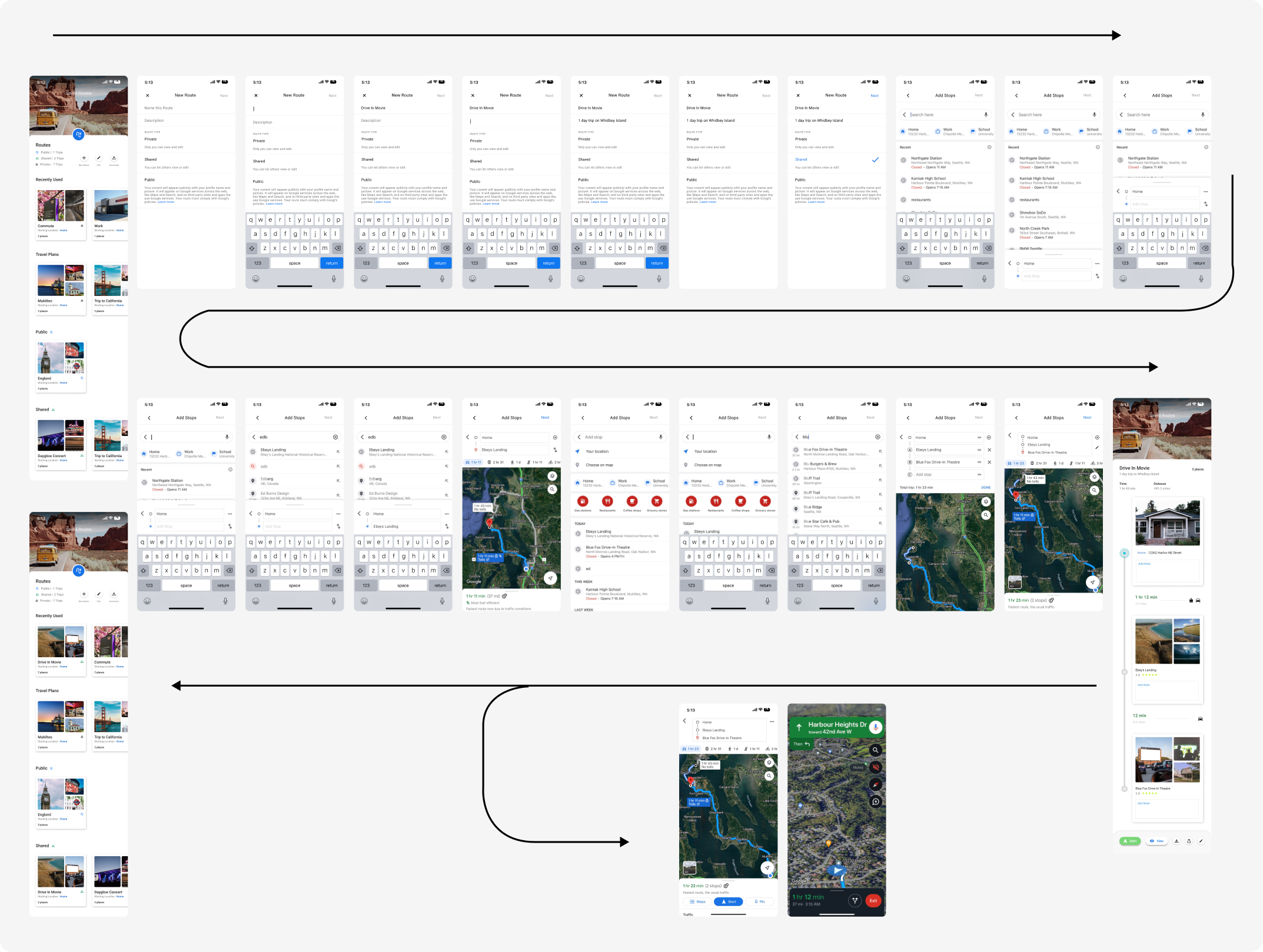
Visual Flow
A very linear paths achieve the desired outcome, which is intended to make the experience streamlined.
<
FINAL DELIVERABLES
DEMO VIDEO
A very linear paths achieve the desired outcome, which is intended to make the experience streamlined.
PROJECT PRESENTATION

previous post
no previous projects
Back to WorKSNext post
no next projects
Back to WorKSVIEW PROJECT
.jpg)
ANISOPTERA SPA 2022
VIEW PROJECT

Redefining Search 2023 - UNIVERSITY
VIEW PROJECT

NETFLIX SCENES 2022 - UNIVERSITY
VIEW PROJECT
Maps Redesign Concepts 2022 - UNIVERSITY
VIEW PROJECT
