
ANISOPTERA SPA 2022
Ensuring a new company’s brand is refined and elegant.
.jpg)
THE Site
Click the link to view the finished site ->
https://www.anisopteraspa.com/THE BREIF
Plan and execute an effective visual guideline as well as establish a cohesive digital presence.
CLIENT
ANISOPTERA SPA
TIMELINE
4 weeks
FOCUS
Visual, UI
TEAM
Just me
MY ROLE
UI Design
Brand Strategist
Visual Design
CREDITS
N/A
My Design Process
The visualized flow of this project, scrolling through this project you can see how I was feeling from where I started to the end result.

<
The Problem
Before the intervention, Anisoptera Spa was not happy with its previous site as it lacked a distinct visual language and suffered from a lack of brand identity.
<
Objectives
Define Anisoptera Spa’s brand image as well as create a site with those values.
<
DISCOVER
UNDERSTANING THE BRAND
As a site and brand redesign I had to understand the brand in the current state. This began with a kickoff conversation with their Director of Spa, where we discussed the brand’s current state as well as what hopes to accomplish, highlighting that they wanted to keep to their roots keeping with what they have but finding a way to improve.


<
CLIENT PAIN POINTS
PRESENTATION OF THE BRAND
- “Our Investor is concerned with the current direction of the visual design”
Understanding that the investor doesn’t feel like the branding matches the high end spa quality it should display.
- “We aren’t sure what needs improving”
“We aren’t sure what needs improving”With a background in UI and Visual design there are key design guidelines that have been overlooked, resulting in the dissatisfaction in the current identity and site.
<
DESIGN GOALS
DESIGN PILLARS
As well as improving the discussed pain points we also wanted to address the foundations of what we believed the brand to be so I outlined the three pillars that make up Anisoptera Spa. We made sure to use it as an outline for our redesign ensuring we integrate each element into our designs.

FOUNDATIONS
- “Anisoptera is the technical definition for Dragonfly”
Maintaining the core values and citing the existing nomenclature will help to refine the design process to create a unique brand identity.
<
VISUAL DESIGN
PITCHDECK
I had to step in mid-way through their design process as they were dissatisfied with the current design direction, with that the contents are from the pitch deck I compiled to show them a refined visual identity.
<
LOGO
Primary Logo
The logo is the most critical and recognizable element of your brand. A thoughtful and consistent application is a cornerstone of a strong visual identity

Supplementary Logo
Having this clean and simple supplementary logo, will only benefit your brand keeping the visual identity strong by as this logo showcases minimal and elegance

Understanding that a good supplementary logo must maintain the 3-10-60 rule, where proportionally the digestibility of the logo doesn’t falter whether up close or from a distance

WORDMARK
Logos emphasize why your business is unique, but this can prove harder to do without any imagery to reinforce the message. However, a distinct business name will set you apart from competitors, and a wordmark will help it stick in people’s minds. Designing our wordmark to be dynamic in size but not in style ensures that it flows while maintaining easy digestibility

<
COLOR
Palette
A dynamic yet calm and relaxing color palette. Colors that exude peace tranquility found naturally from the physical world.

Builds
Hues of blue and purples are known for exuding calmness, peace. Which was the foundations of this crafted set of colors. Each color has a cool undertone, vitally our asset colors (our a and white) are not their pure form they have those subtle cool differences helping craft a feeling many will not even realize is there.

PAIRINGS
Specifying your color pairings early will help negate design conflict as we have pre-set combinations. Additionally pure black and white could be substituted in per instance occurrences.

Contrast is immensely important in using these colors keeping your visibility at all times, with the Lavender and Stone White the contrast ratio is at 6.83 and the Aqua Black and Stone White contrast ratio at 13.81
<
TYPOGRAPHY

Display Type Choice
Laura Worthington
“An award-winning typeface designer, Laura Worthington has built an extensive body of work based on her original concepts and hand lettering. She is especially known for evocative display typefaces, specializing in calligraphic script designs, often offered with an astonishing abundance of swashes, alternate letterforms and illustrative ornaments.”

Type Choice
Richard Lipton designed Meno Text in 1994 as a modest yet elegant workhorse serif family in six styles

<
VISUAL APPLICATIONS
MOCKUPS
By designing for the future, it is easier to demonstrate the brand’s image and how it will be implemented on future products or goods.


<
FEEDBACK
DESIGN DECISIONS
After the deliverable of content for the redesign there was only on change that was made to all of the content. This was changing the stem of the dragonfly from a pointed to a twisted tail. They felt this version created a more organic look rather than the straight edge of the first version.
<
UI DESIGN
HIGH FIDELITY WIREFRAMES
With the client wanting to get a strong grasp on what the future website would look like I preferred to showing along with he other visual deliverables a higher fidelity waireframe of the landing page.

<
WEBSITE
LANDING PAGE
Following along with their expectations and direction, I set up a temporary website a cool toned simplistic design that highlights the brand image, with minimal external imagery or content. Building thier brand from the ground up we had to wait to establish and capture photos and video for the website.

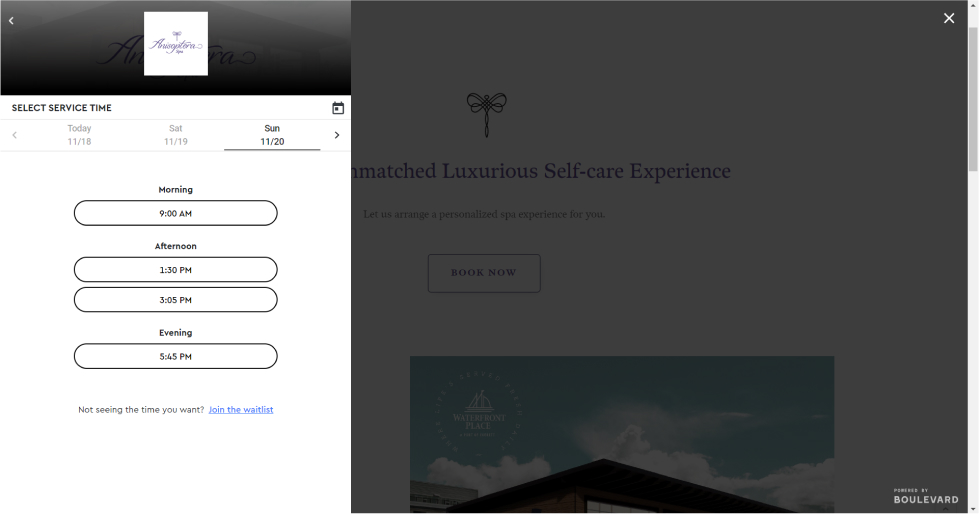
INTERGRATED EXTERNAL SERVICE
A necessity to their website build integrating a second party service into the sites’ system so they would be able to ease the booking process.
CMS COLLECTIONS
A customized collection list created for the owner, so they would have full control of adding, subtracting or editing their list of services they offer without the need of designer intervention.

<
OUTCOMES
OVERALL DATA
Following their the data a month after their soft launch, all specified data points have increased from the previous site version.

INSIGHTS
With more specified data aspects, the site is exceeding the predicted outcomes.

<
Thank You
Thank you, Anisoptera Spa for the opportunity to work on this project!
previous post
no previous projects
Back to WorKSNext post
no next projects
Back to WorKSVIEW PROJECT
ANISOPTERA SPA 2022
VIEW PROJECT

Redefining Search 2023 - UNIVERSITY
VIEW PROJECT

NETFLIX SCENES 2022 - UNIVERSITY
VIEW PROJECT

Maps Redesign Concepts 2022 - UNIVERSITY
VIEW PROJECT
